The magazine that I am doing is: What Laptop
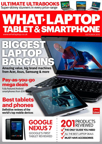
Colours: The colours that have been used on the magazine are simple but vibrant colours, they are colours that grab your attention straight away, from my perspective I would rather pick up a magazine that stands out to me than a magazine with just grey and black writting.
Font: The font that stands out the most is the masthead, this attracts my attention because of the red background and then the white writting on top, also the fact that it's bold is very eye catching because it's the largest text on the front page.
Images: The images used on the front cover are all technology of course because it's a technology magazine. The main image they have used is the laptop because it is probably their main article in the magazine as the text that's next to it implies that it is a large font and is the seconds largest font on the page.